Launch is the official brand identity developed for UNC Charlotte’s BFA Senior Exhibition. Multiple concepts were proposed across the class, and our group’s idea, Launch, was selected by majority vote. I took the lead role in refining the brand direction and redesigning the final exhibition logo.
Initial Designing Phase
The branding began with an exploration of display serif typefaces that could balance elegance and futurism. Several options were tested to identify a style that communicated sophistication, visual impact, and an editorial tone appropriate for a senior exhibition.
Typeface Exploration
The branding began with an exploration of display serif typefaces that could balance elegance and futurism. Several options were tested to identify a style that communicated sophistication, visual impact, and an editorial tone appropriate for a senior exhibition.

Logoform Exploration
The branding began with an exploration of display serif typefaces that could balance elegance and futurism. Several options were tested to identify a style that communicated sophistication, visual impact, and an editorial tone appropriate for a senior exhibition.
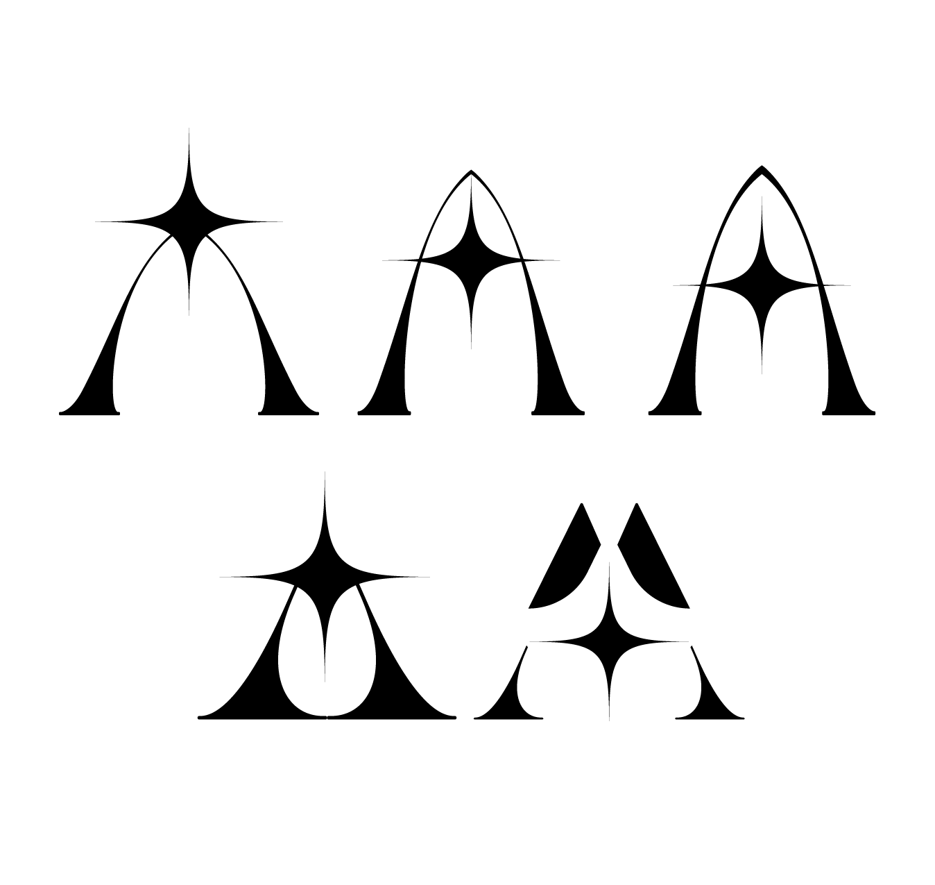
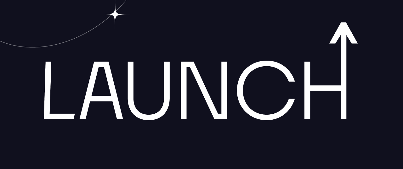
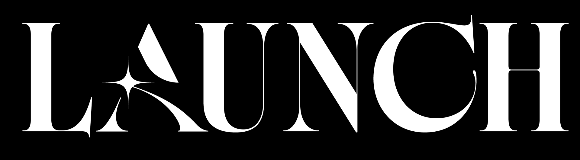
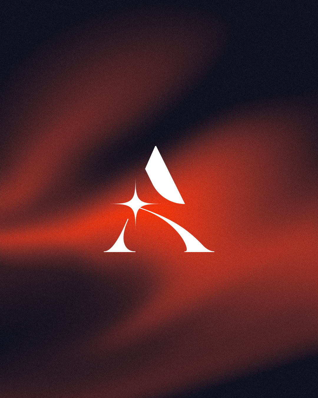
Final Logo Direction
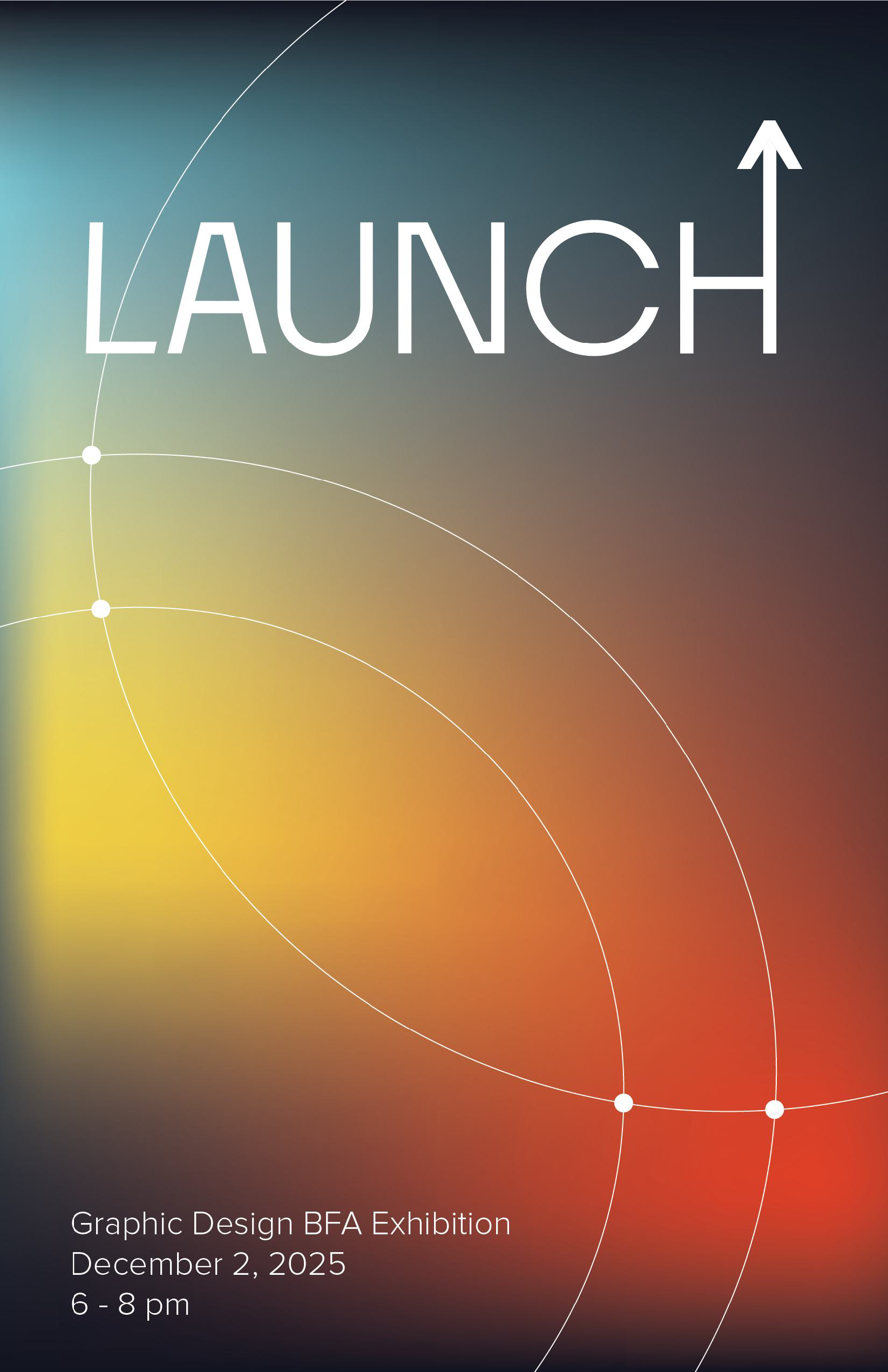
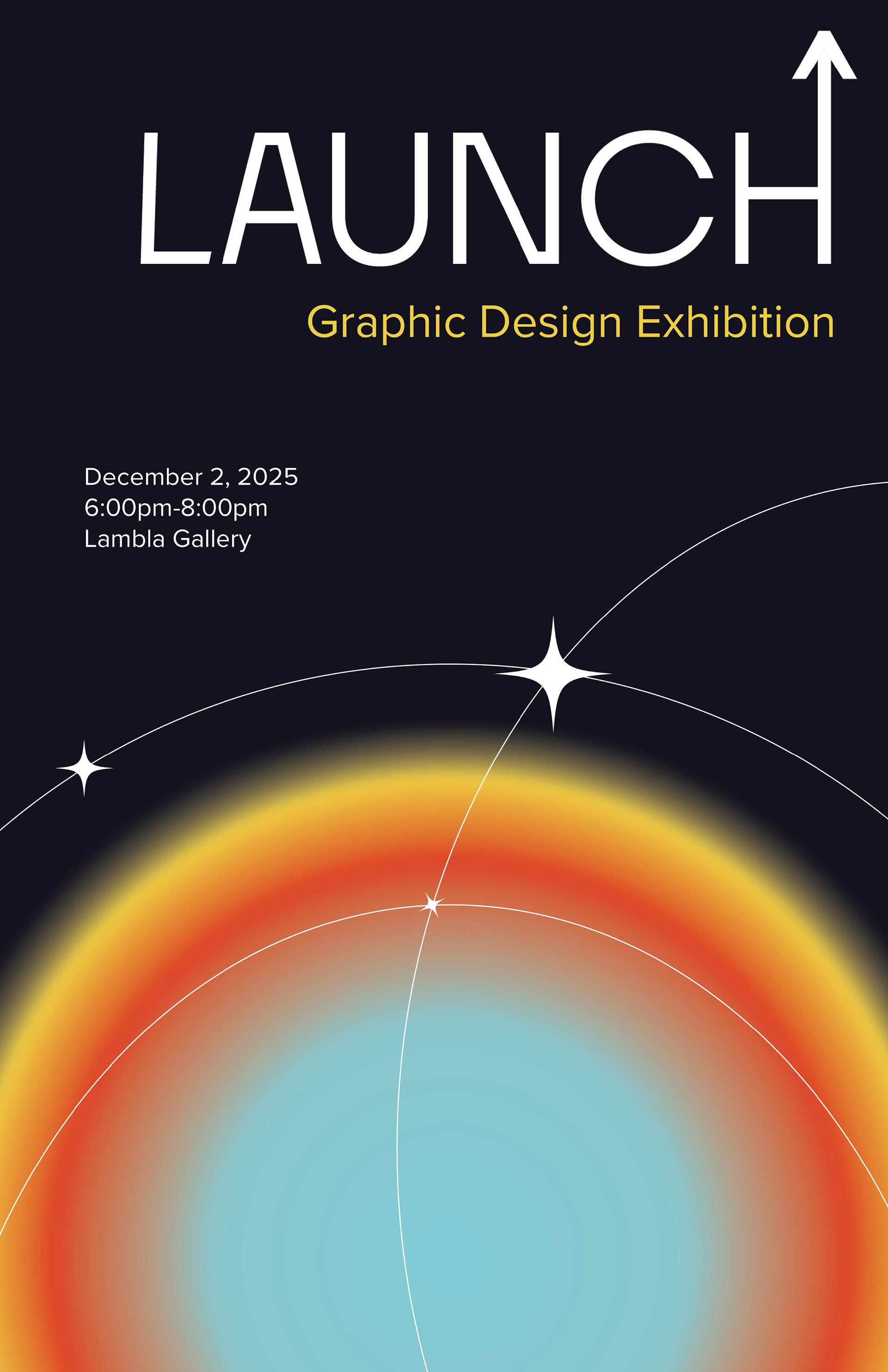
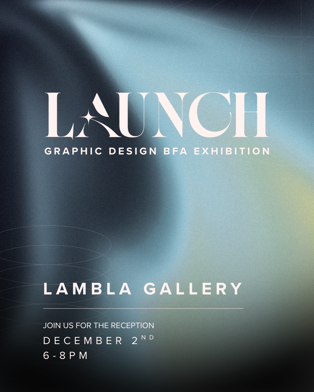
The final logo solution (second revision) combines a high-contrast serif foundation with a radiant starburst embedded in the “A.” This mark captures the exhibition’s central message: rising forward, entering the next stage, and creating ignition behind our work. Its sharp curves, celestial presence, and bold silhouette define the core aesthetic of the Launch identity.


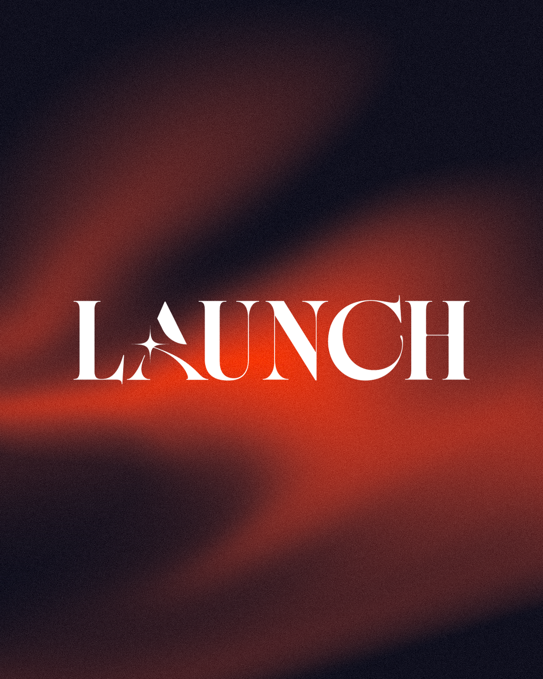
Wordmark & Logo Lockup
The completed wordmark pairs the refined “A” with a full typographic lockup, resulting in a cohesive and memorable brand signature. Both light and dark variations were developed to ensure strong visibility across exhibition materials, digital screens, and promotional assets.

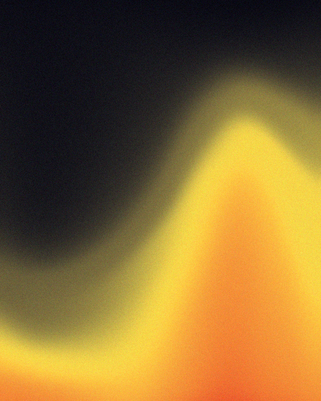
Gradients
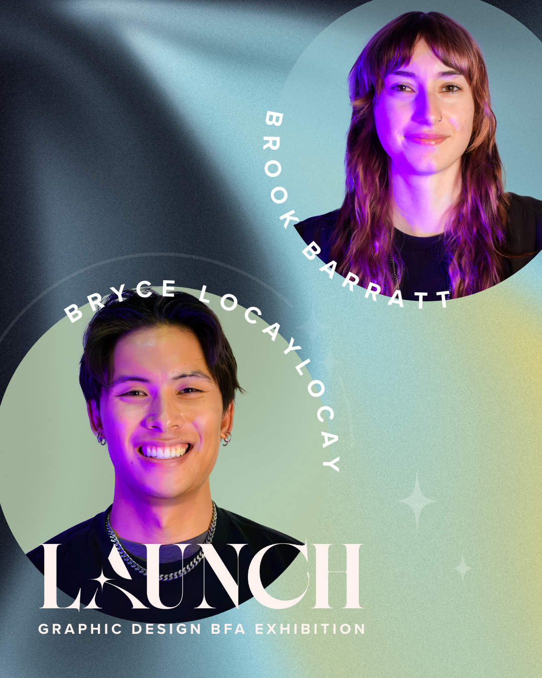
The gradient system became a defining visual element of the Launch brand. I developed these gradients to reflect momentum, energy, and the feeling of moving forward—core ideas behind the exhibition’s theme. Their atmospheric, soft-blended look gave the identity a modern, immersive quality and became a recurring motif across posters, digital assets, and social media.


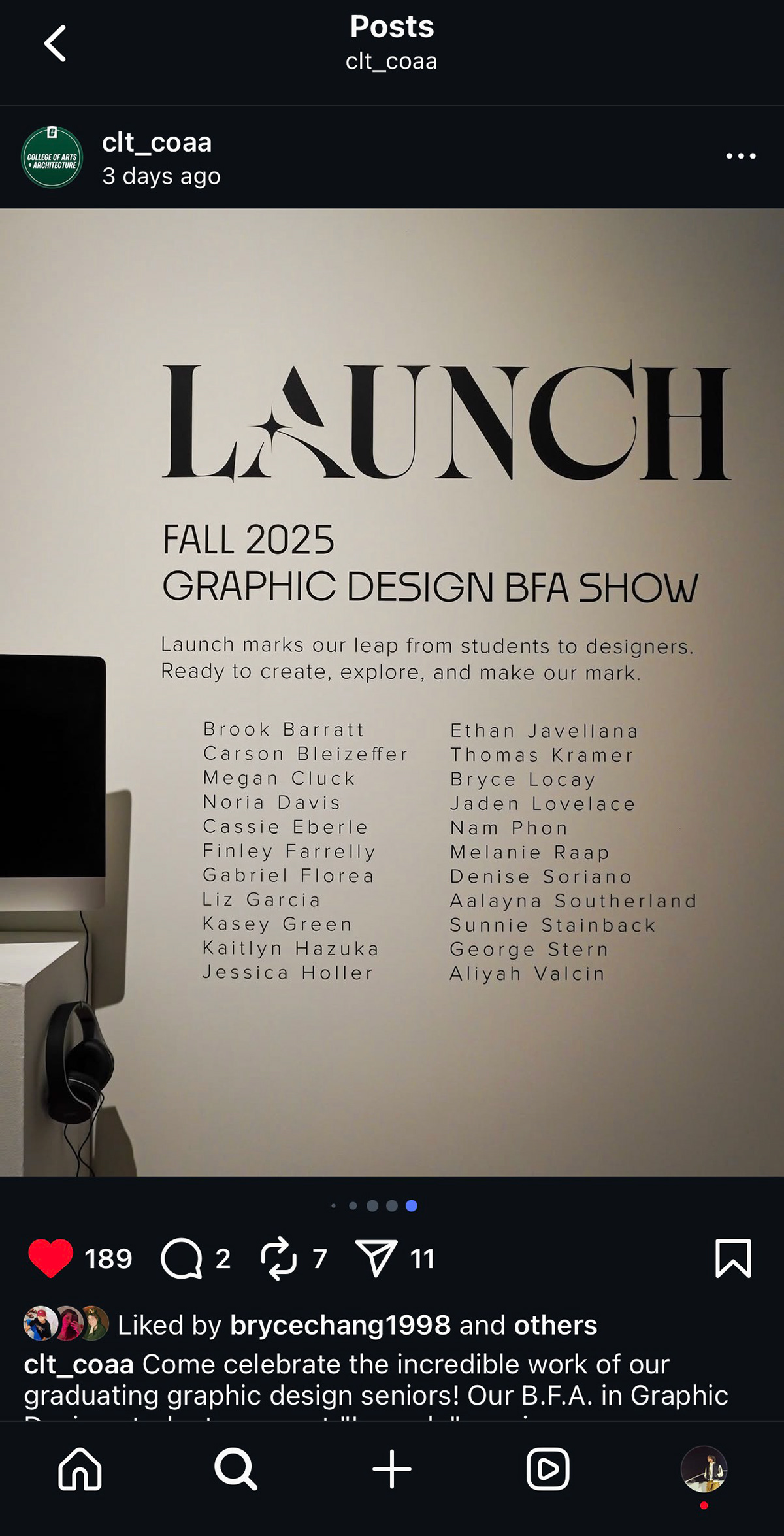
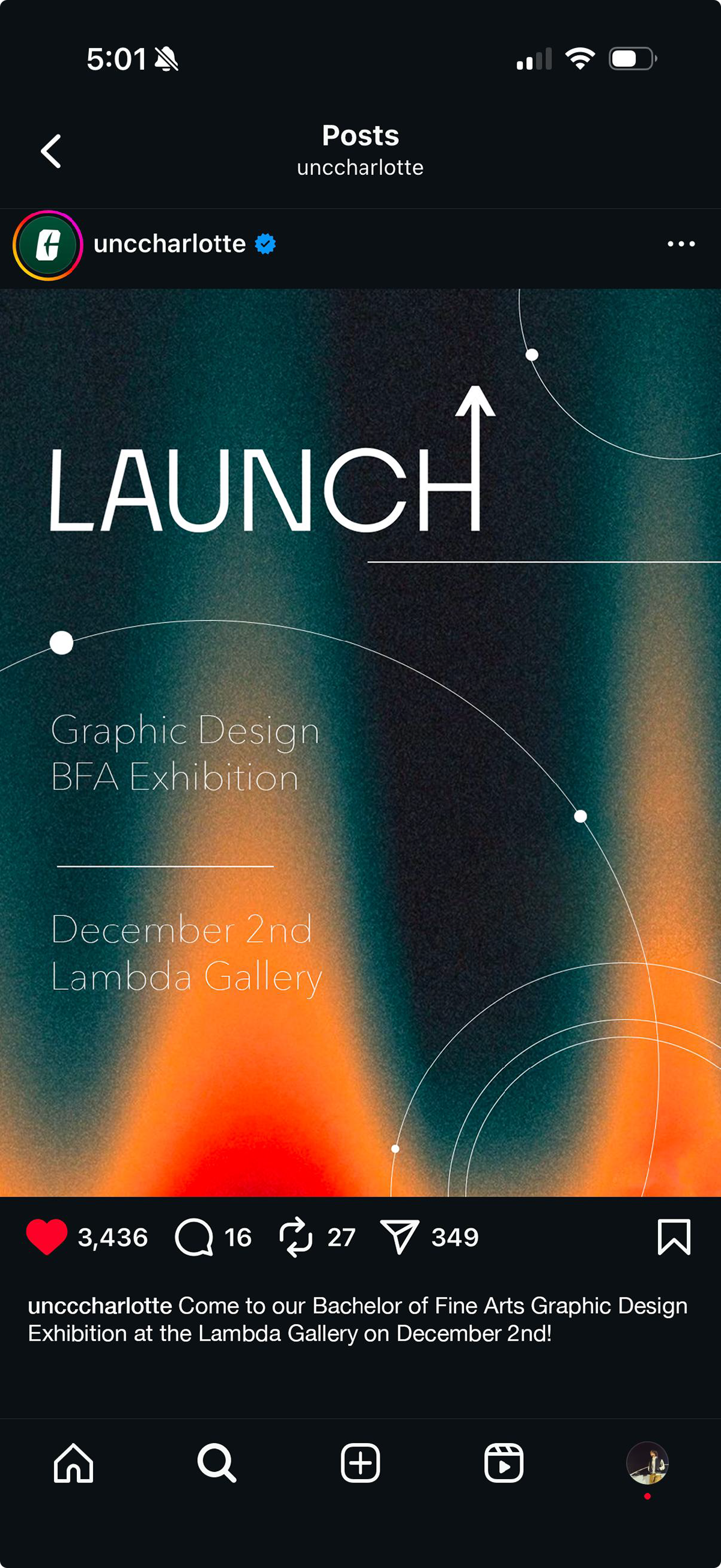
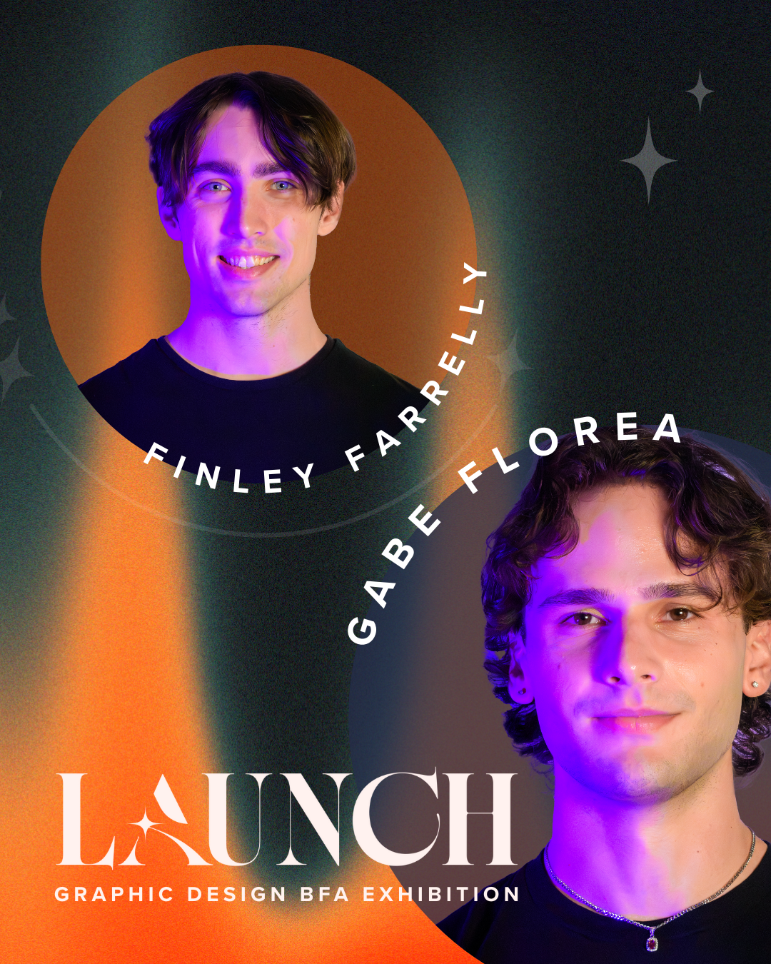
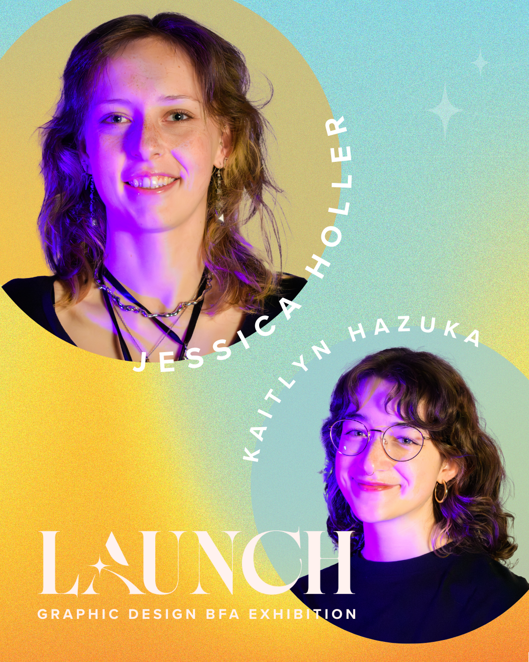
Exhibition Social Media Cards
These social media cards were composed by a classmate. I contributed the logo design and provided the design direction and aesthetic that guided the overall look.
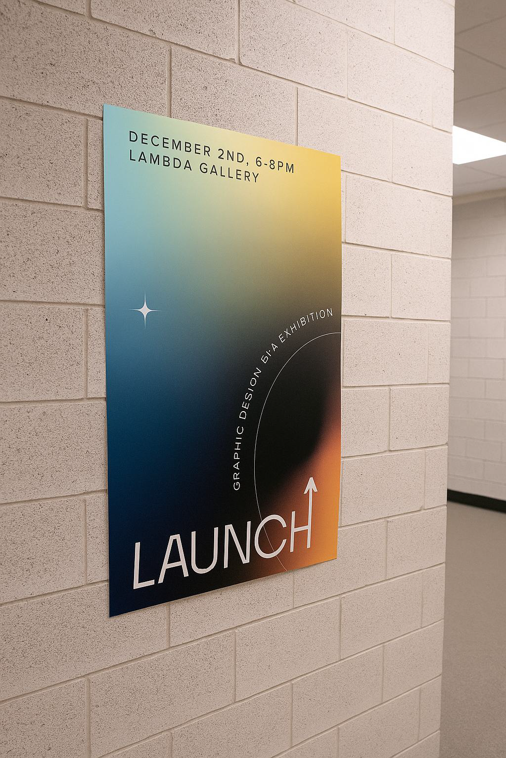
Mockups / Exhibition Preview
A series of exhibition mockups showcased how the Launch brand would appear in the physical gallery space. These mockups highlighted the final logo, gradient system, and typographic layout applied to signage, wall graphics, and social media displays. This section helped visualize the full experience visitors would encounter at the BFA Exhibition.