Created March–May 2025 for Print Production at UNC Charlotte, this POP display for GRIND brings a street-art, high-energy identity to life through bold textures and vivid, urban colors.
Process Work
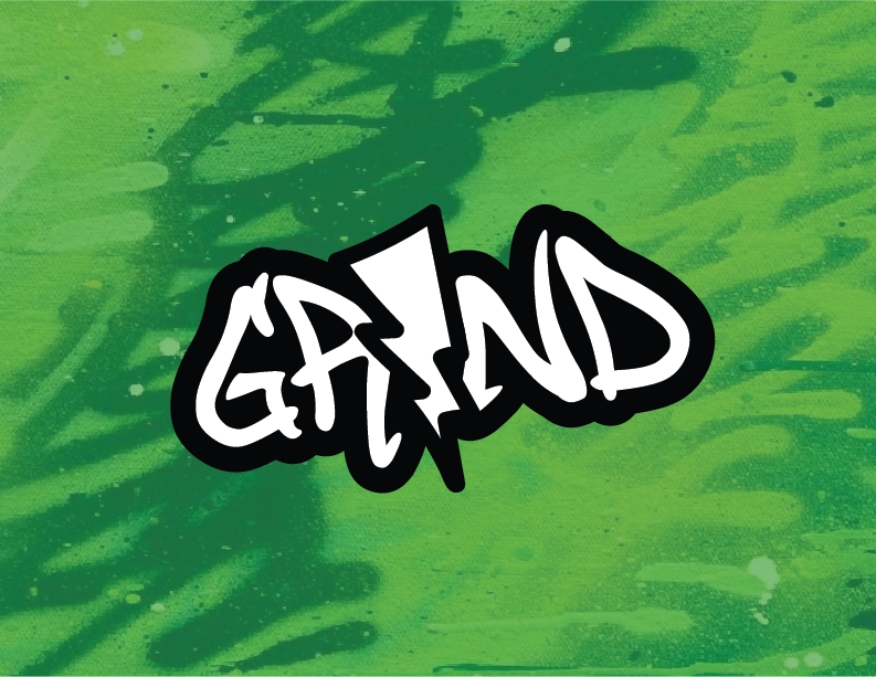
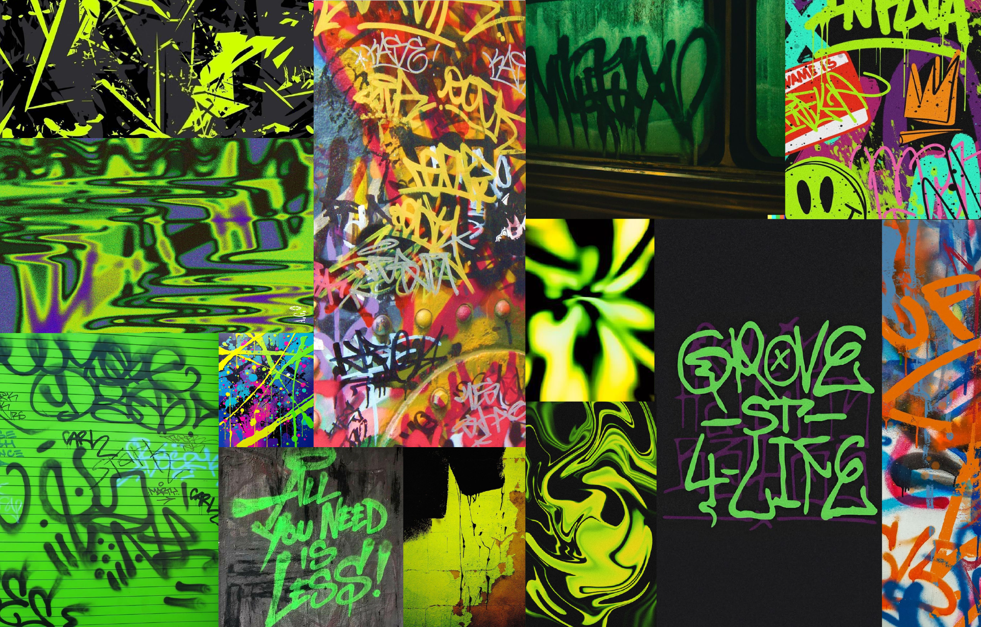
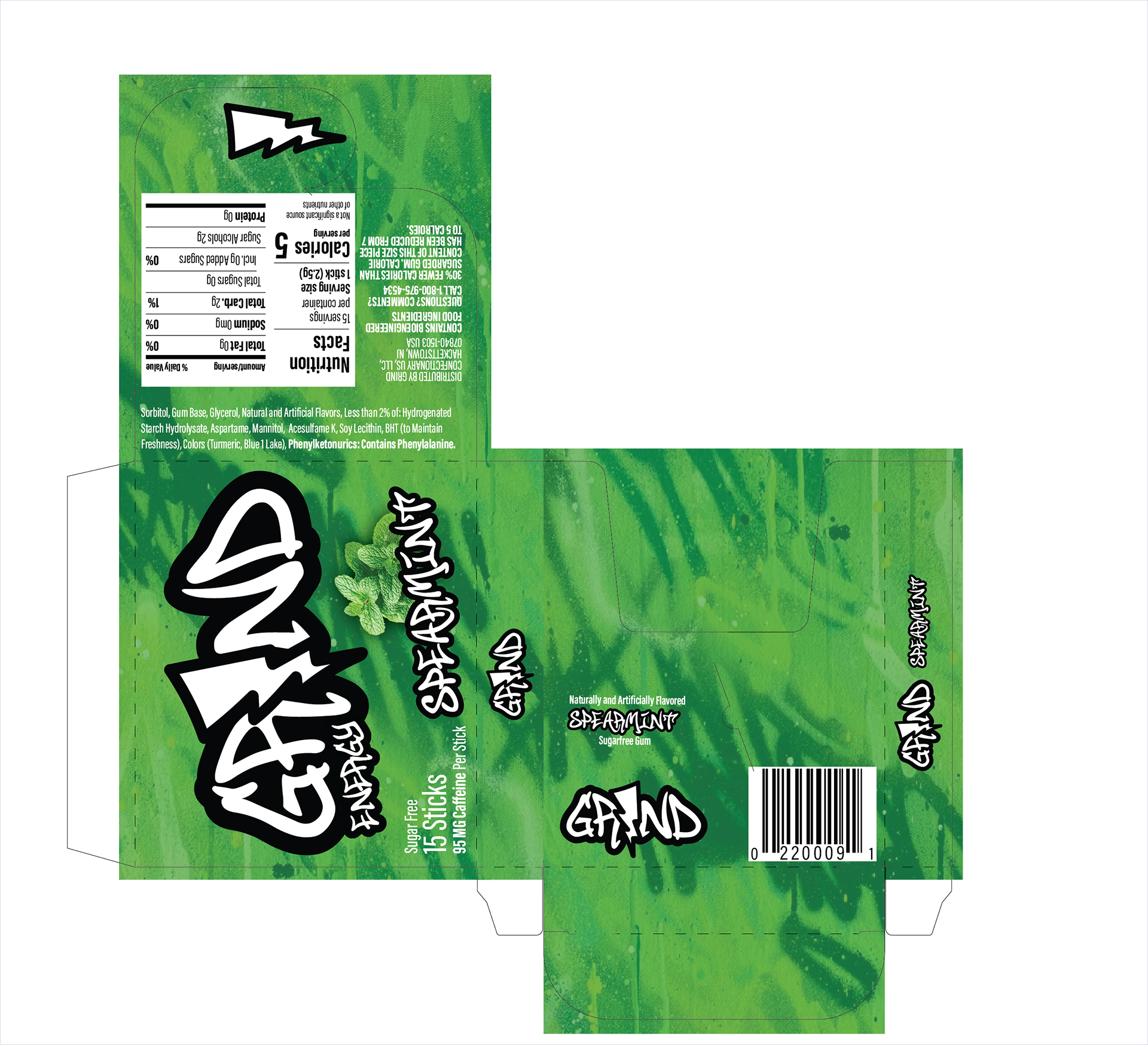
GRIND’s identity pulls from street art, graffiti tags, and urban textures. Spray-paint-inspired typography and a palette of electric green, deep black, and crisp white create strong contrast, while layered graffiti patterns give the brand its gritty, high-energy feel.

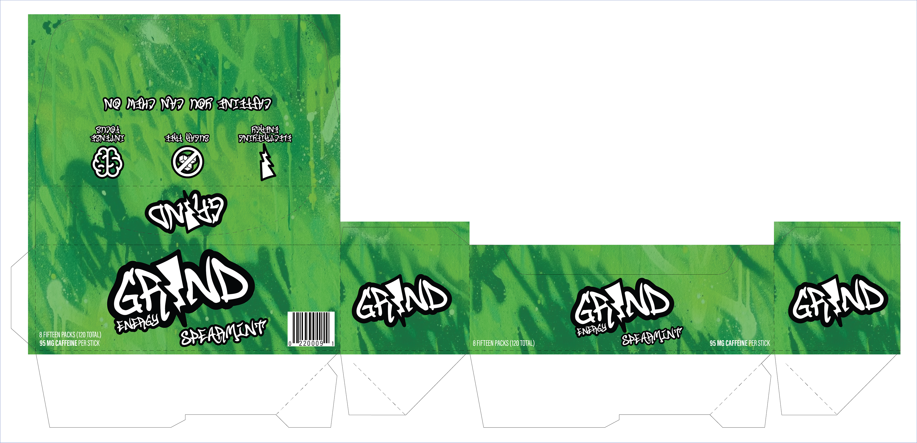
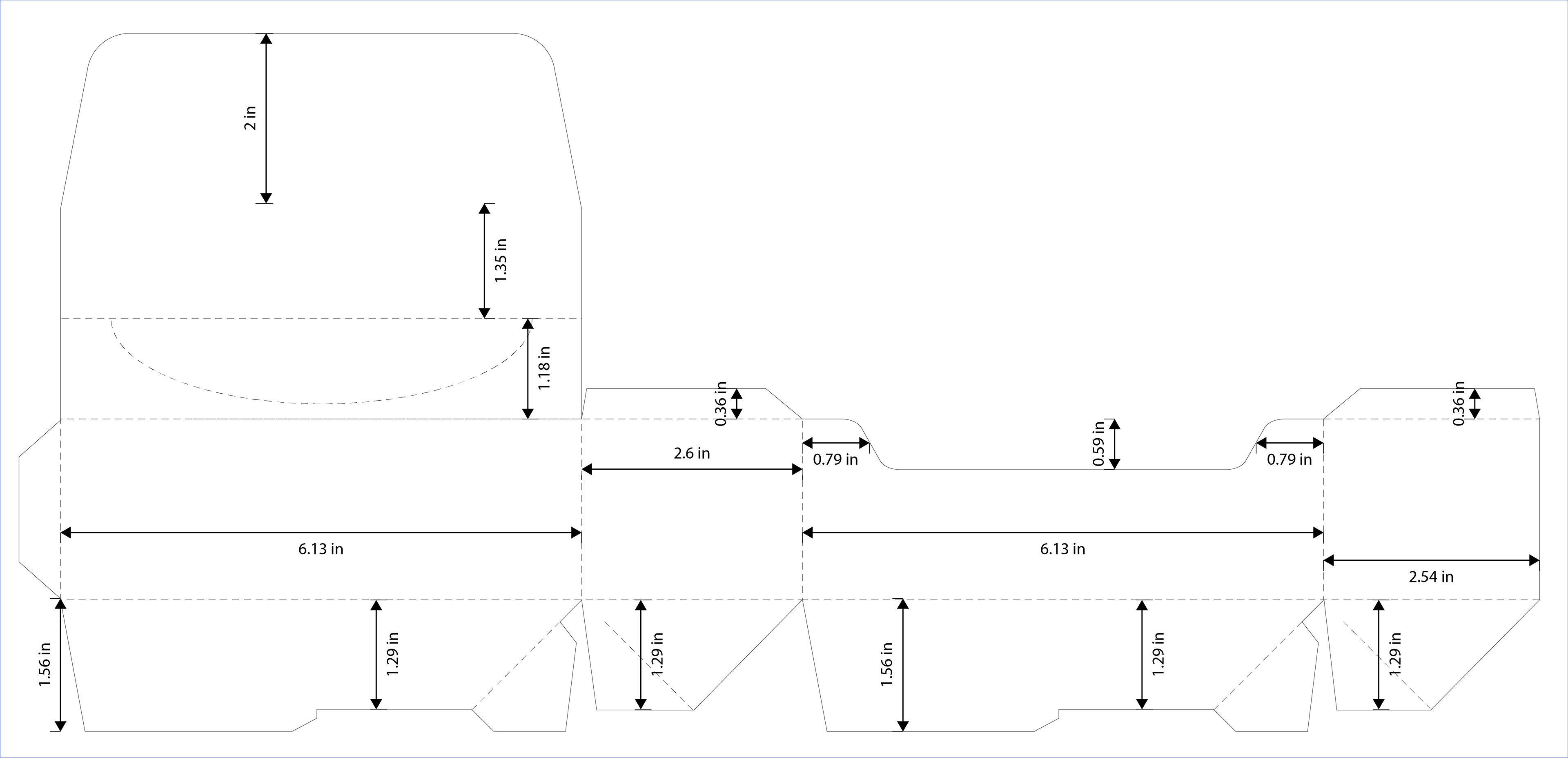
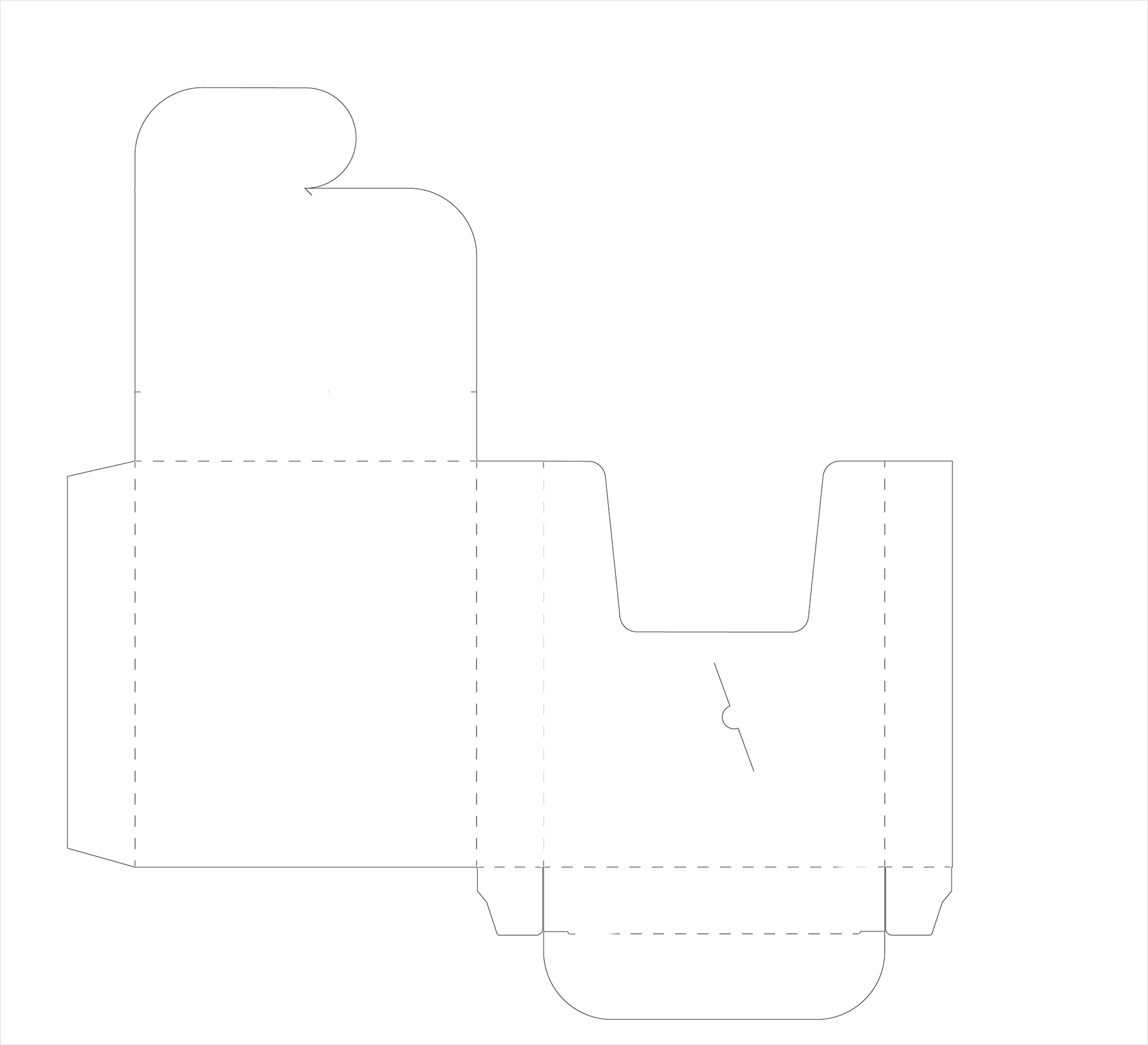
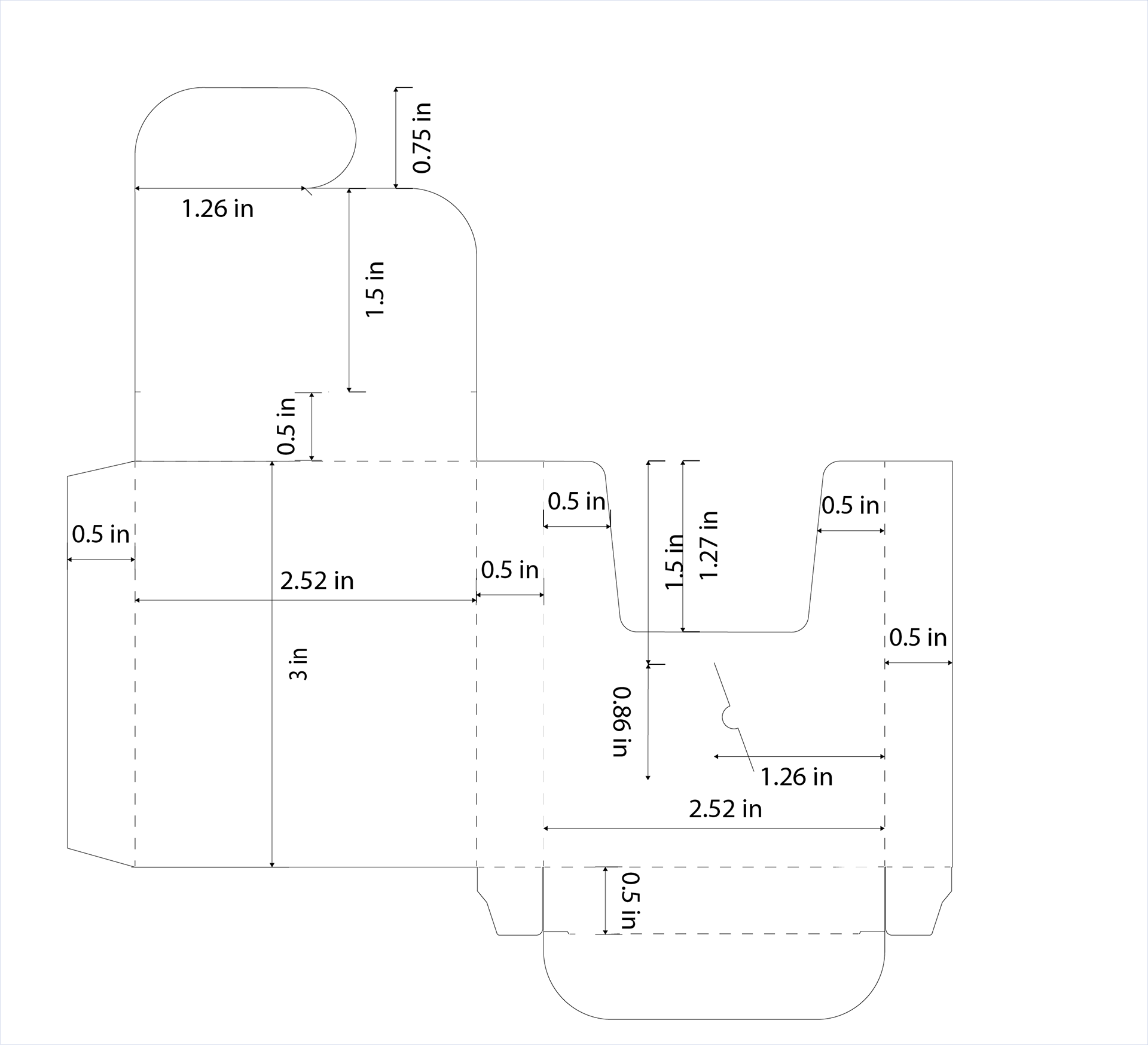
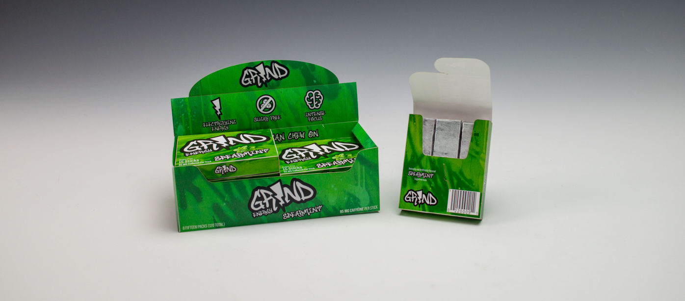
Dielines & Structural Layout
Carefully developed dielines ensure precise folds, clean alignment, and secure structure for both the gum packaging and POP display. Detailed measurements guide accurate trimming and assembly, while the layout maintains a compact form and seamless graphic alignment on all sides.

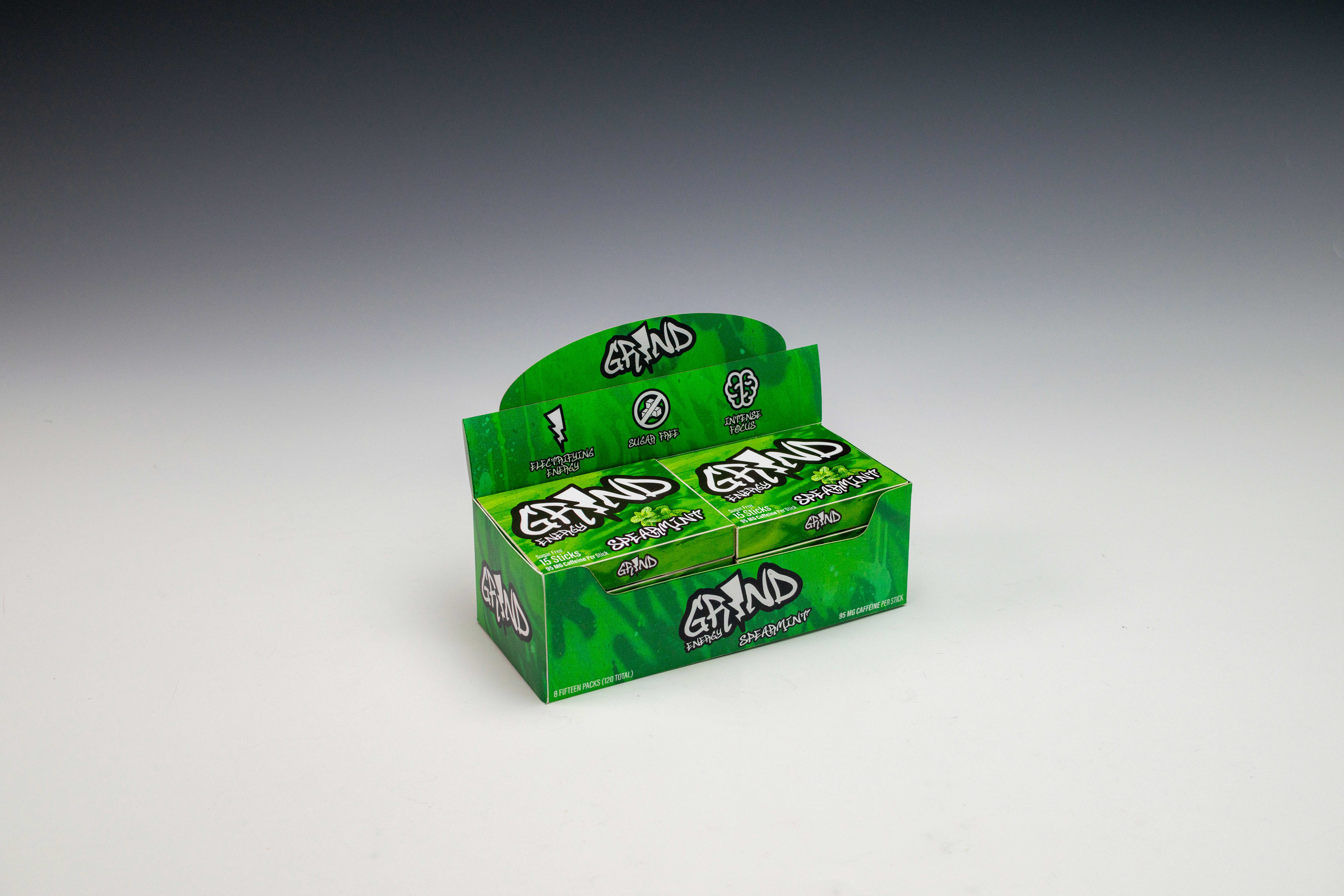
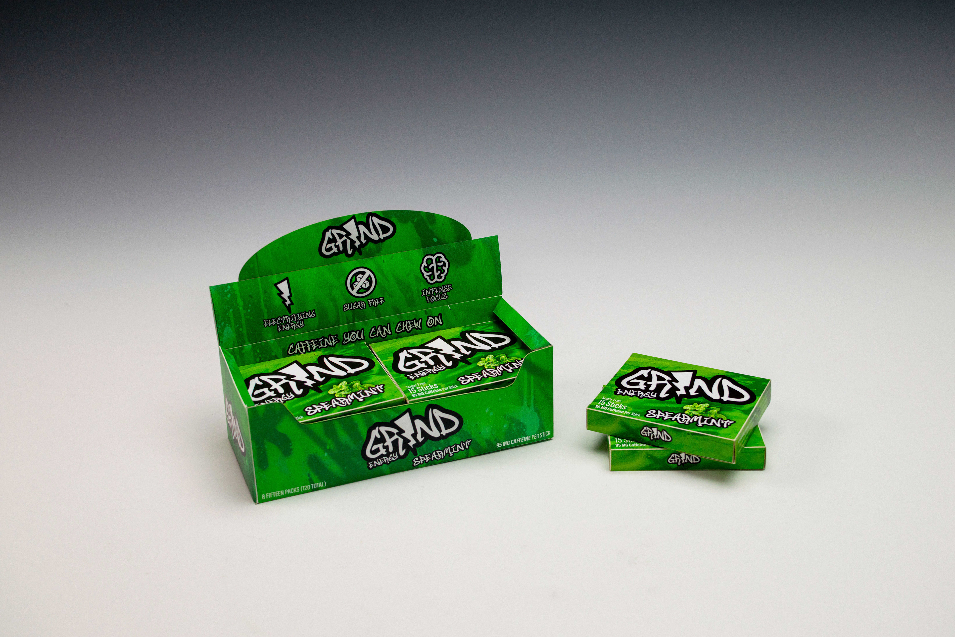
FINAL MOCKUPS
Final mockups display the GRIND packaging in a realistic retail setup, with each piece laser printed, cut, and hand-assembled for accurate alignment and a professional finish.

Inspired by street art, GRIND uses bold textures, spray-paint typography, and high-contrast colors to express its raw, fast-paced identity and rebellious energy.