Concept & Purpose
Demeter is a food-ordering and nutrition app designed to help busy students make healthier choices quickly. The goal was to simplify meal planning with clear navigation, accessible nutritional info, and a clean, student-friendly interface.
User Personas
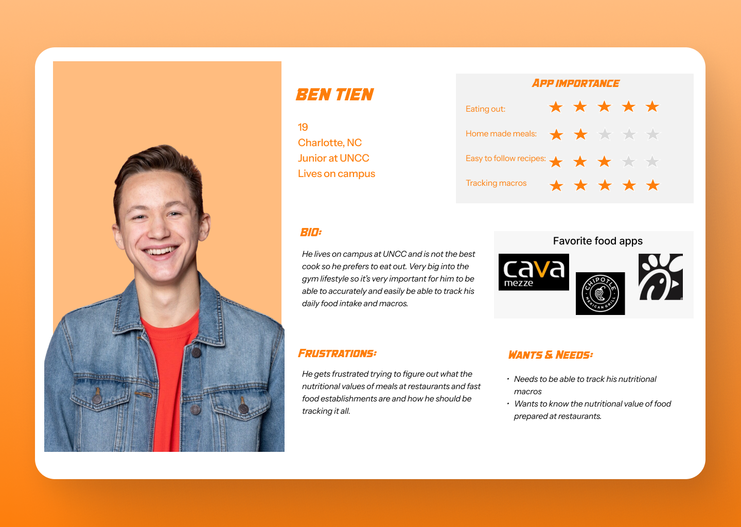
Ben Tyn — Busy & Goal-Driven
Needs quick, affordable meals and simple nutrition insights to fit his schedule.
Needs quick, affordable meals and simple nutrition insights to fit his schedule.
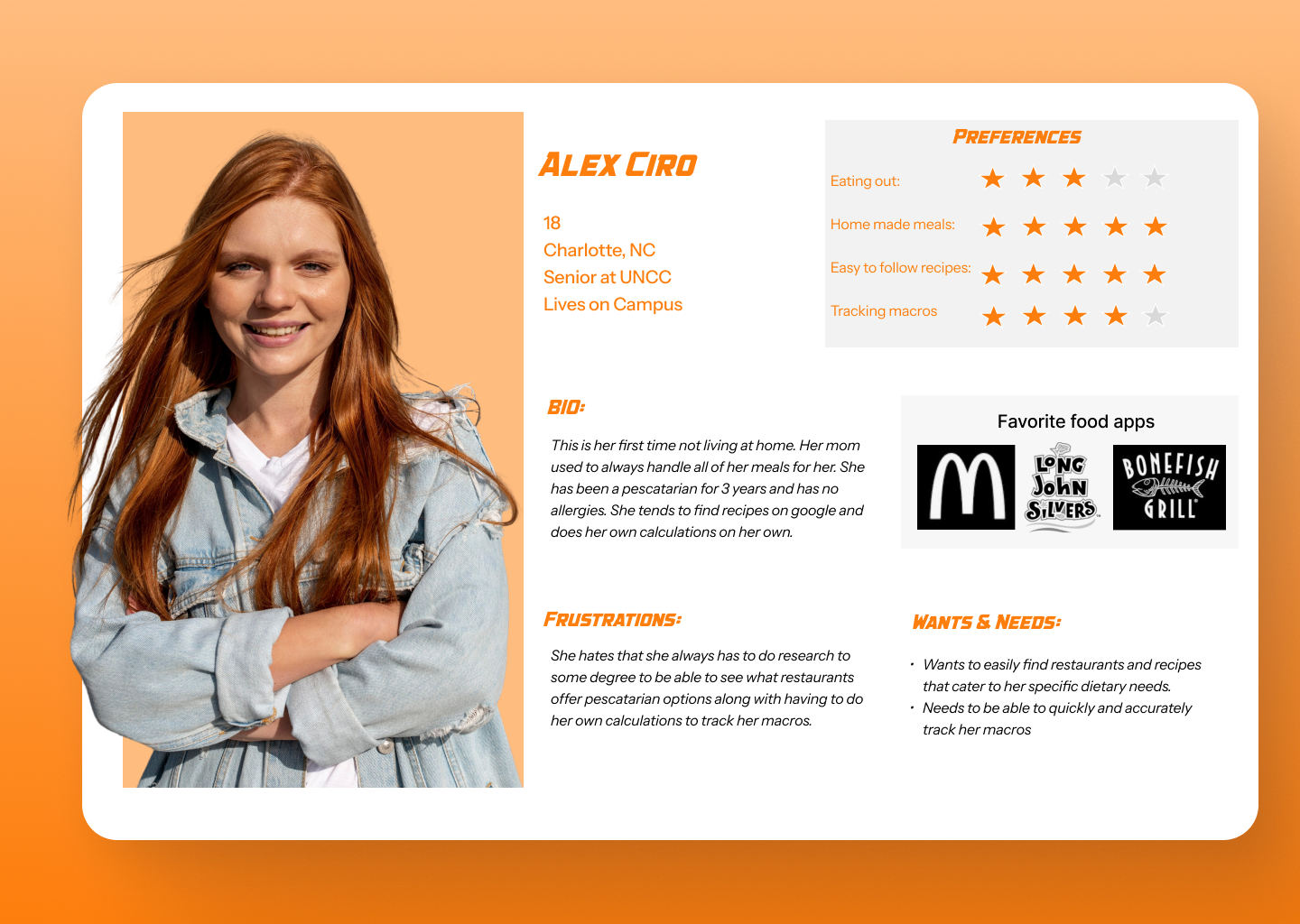
Alex Erb — Health-Focused Planner
Wants balanced meals and reliable nutritional info that supports her organized routine.
Wants balanced meals and reliable nutritional info that supports her organized routine.
Touchpoints & Opportunities
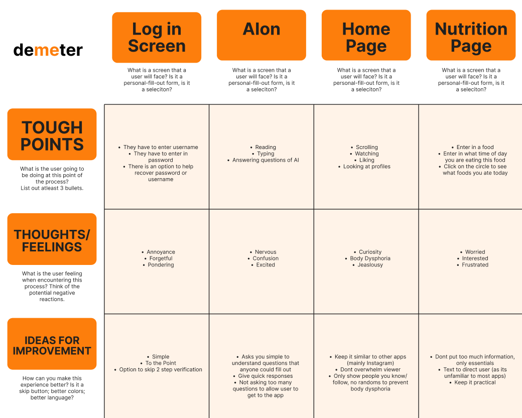
Mapping the user journey revealed opportunities for clearer navigation, streamlined meal browsing, and more accessible nutritional summaries. These insights guided the app’s structure and flow.
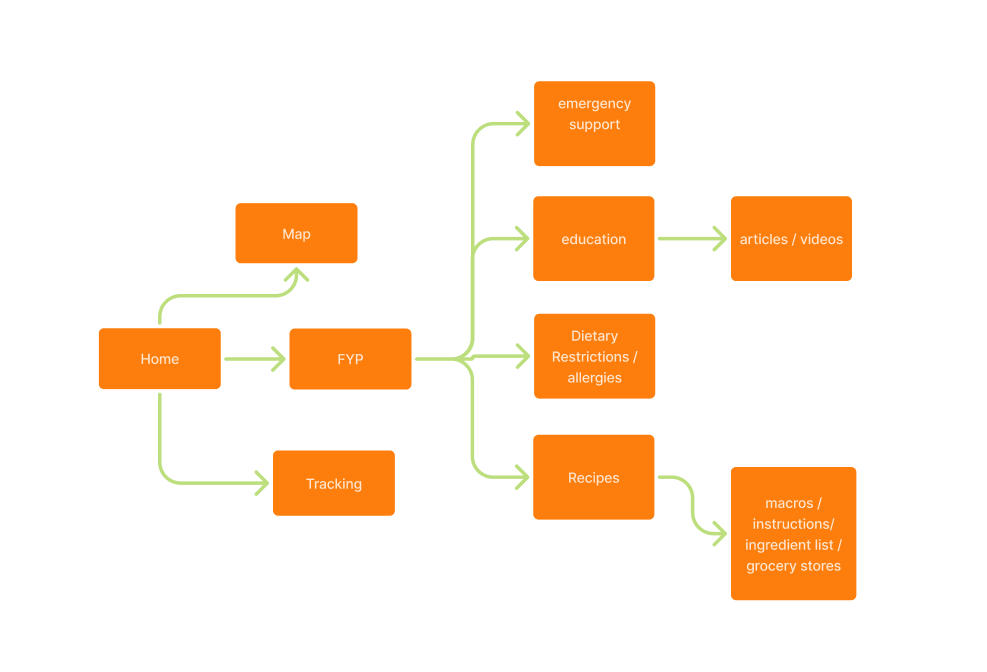
Design Process
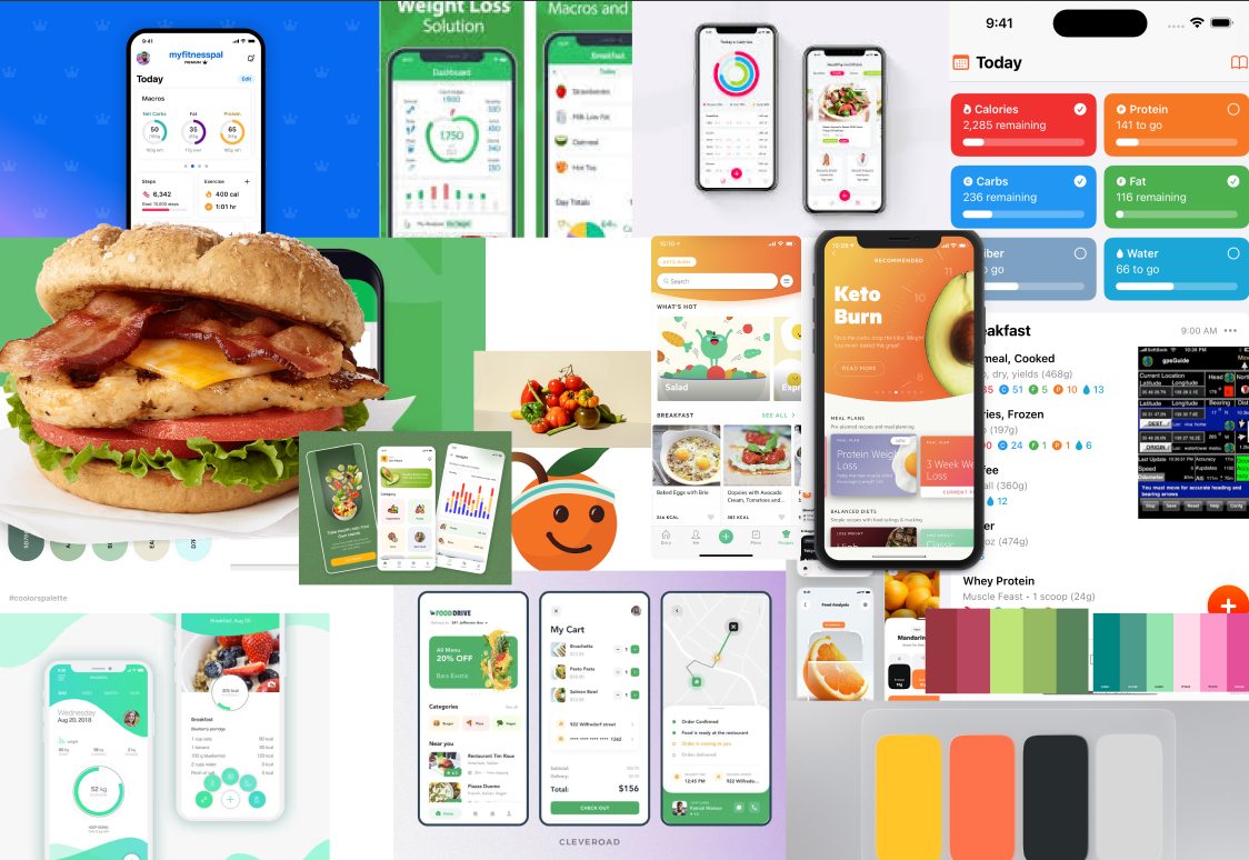
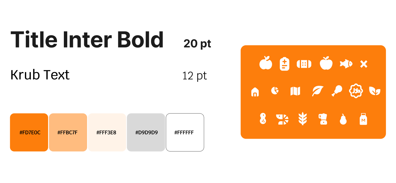
Demeter’s visual direction balanced warmth and clarity using bright orange accents, clean typography, and organized layouts. The process included sketches, low-fidelity wireframes, a simple design system, and fully refined high-fidelity screens.
Lo Fidelity
Low-fidelity wireframes established core layouts, navigation flow, and screen hierarchy. This stage focused on structure to allow quick iteration and feedback before adding visual detail.
Hi Fidelity 1
The first high-fidelity screens introduced color, icons, imagery, and spacing. This round refined hierarchy and brought personality into the app’s recipe cards and nutrition pages.
Hi Fidelity 2
The second high-fidelity pass polished spacing, contrast, and visual consistency across screens, preparing the design for a cohesive prototype.
Final Prototype
A clickable prototype was created to demonstrate app flow—from browsing meals to viewing nutrition and placing an order—supported by a simple device mockup to show the experience in context.
